Serve 'Dark Mode' Images Natively

More and more websites, particularly technical blogs, are leveraging the prefers-color-scheme media query to provide a dark or light theme based on the user's OS preferences.
I think this is brilliant. Personally, I like to dark-mode all the things, so this works for me. That said, when it comes to images (particularly screenshots), I find a white image in a dark theme can be quite jarring. My eyes! The goggles do nothing!
What if we could present different images tailored for a user's dark (or light) preferences?
Well, it turns out we can! Natively. That's right! No JavaScript, no CSS wizardry, just good ol' plain ol' native HTML.
"I've seen enough, gimmie the code already!"
The prefers-color-scheme media feature
This media feature is relatively new to browsers (landed in Firefox in May 2019) and seems to be spreading like a locust plague as those of us on the dark side clamber for some of that dark-mode goodness.
The team at MDN describe it more succinctly:
"The prefers-color-scheme CSS media feature is used to detect if the user has requested the system use a light or dark color theme."
A very basic demonstration of a prefers-color-scheme media query:
body {
    /* Default Light Scheme */
    color: black;
    background: hsl(0, 0%, 85%);
}

@media (prefers-color-scheme: dark) {
    body {
        /* Lovely moody Dark Scheme */
        color: white;
        background: hsl(0, 0%, 15%);
    }
}
The <picture> element
I suspect many of you may have just had the aha! moment I had a few weeks ago and figured it out. You might as well just stop reading right now and go and figure out how to extend it further 😉.
The <picture> element provides a nice native mechanism for presenting different images based on specific media queries.
A generic <picture> element example stolen verbatim from MDN:
<picture>
    <source srcset="/media/examples/surfer-240-200.jpg"
            media="(min-width: 800px)">
    <img src="/media/examples/painted-hand-298-332.jpg" />
</picture>
With your powers combined...
Combining these two very standard out-of-the-box native techniques, we can serve different images depending on a user's preferred colour scheme!
This is a bit like the first time you see sour cream and sweet chilli sauce served together with your potato wedges; at first the combination of these two simple ingredients seems a bit weird, but together it just works so well. (Oh wait, is that just us Aussies...?)
<picture>
    <source srcset="https://placehold.co/400x300/1D1E22/fff?text=Dark+mode" media="(prefers-color-scheme: dark)">
    <img src="https://placehold.co/400x300?text=Light+mode" />
</picture>
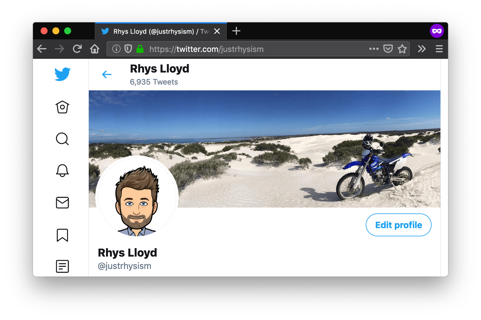
And a real-life example using some pleb's twitter profile; open up your OS theme toggle and switch modes to see the image change:

Inevitable caveat
Whilst playing with this technique, I quickly realised that it falls down if you've implemented a manual toggle to switch the scheme locally on your website, like the way Andy Bell describes in great detail. To see what I mean, toggle the theme on this site by clicking the sun (or moon) on the top-right of the viewport.
This is because the media query doesn't consider your local site settings (which are bespoke), nor is it possible to use CSS selectors inside a media query.
That said, I'm sure it wouldn't take much to sprinkle on a bit of magic JS dust to get it all happening. A post for another time.
TL;DR Sandbox Demo
In the meantime, check out my sandbox, open your OS scheme settings and have a play around.
Wrapping up
Sometimes the coolest little techniques are right under our noses, and are just a matter of combining a few ingredients we might not have previously thought about going together.
By combining the prefers-color-scheme media feature and the <picture> element which supports media queries, we're able to display images better suited to the user's colour-scheme preferences.
Reach out to me on Twitter (@justrhysism) and let me know of the cool things you're doing with this technique, or other simple combinations with powerful results. I'd love to see them!
Until next time, hooroo!